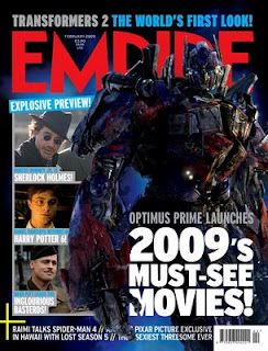
I have decided to base my film magazine upon the Empire magazine. I will use similar fonts and colours, as well as use the name of the magazine and its slogans.
I analysed various Empire magazines, taking in account what makes the magazine stand out and interesting. I found the colourful colour scheme and the contrasting tones made an impressionable effect. The typical conventions Empire used, were the colour red, barcode, date and the magazine's website.


This version of Empire magazine is defnitely a lot more unique to the other issues. This is due to the fact that they have broken the typical convention - using the colour red, instead they've produced a different colour scheme, ranging from the colours black, gold, white and blue. Obviously the colour theme for the movie 'Avatar' is blue, which would have clashed with Empire's orginial colour scene of red.
Gold represents modern, where it makes the magazine sophisticated. There is a close-up of the character's face, where this time around the head is behind the text 'Empire'. The reason for this could be due to the dramatic change of the colour scheme, where the public may not recognise it at first; therefore the title is on view; catching the audience's attention. Black is used which sets a dramatic mood.

Black, again is used which sets a dramatic effect on the magazine, with blue blended in. The typical convention is included in this issue, where the font colour is back to red and the image is placed in front of the text, while furthermore the barcode, date and website address is included. Snapshots from various films have been captured showing close-up's on their face's and placed on the left hand side of the magazine. All together, 5 different colours are used. The camera seems to be shot at a low angle, with a medium shot of the model. It tends to blend in with the background, which creates suspense. White font is striking and clear to see, which is an effective way of grabbing the reader's attention.

I analysed a range of Horror film posters, looking at the typical conventions they used, and how I could aspire to them and interperet them in my own poster.


All of the existing posters show the typical conventions, where they tend to include the name of the film and its release date, along with a slogan line, as well as the name of the stars, credits/productions, shown at the bottom of the page and sometimes showing the age certificate and mise-en-scene to reflect the film’s plot.
'Drag Me To Hell' shows a medium close up of a woman screaming, where she looks as though she's in a struggle of escaping from something. When looking closer you can see a pair of unusual looking hands grabbing onto her, where the mise-en-scene shows a house in the background, which fades in with the hands. It contrasts effectively with the fire shown at the bottom, where her body also fades in with this, as though she is on fire. The fire could be some sort of representation of hell, as this is the sort of picture it paints, creating drama. The dark colours suggest danger, bad. In the poster 'Sorority Row' the layout is slightly different. Although it holds the same conventions and the characters look traumatised and in a struggle, it shows photograph strips consisting of various shots that have been taken from the film fo the characters that tend to be close-up showing their reactions. Dark tones are used, again suggesting bad.


'The Hills Have Eyes' and 'Orphan' are the complete opposite of eachother. 'Orphan' hols a mysterious type of mood, where the public are unable to work out what genre of film this is. However, the slogan line "There's something wrong with Esther" shows an indication not everything is normal, and that there will be some sort of twist in the film. It is a close-up shot of the girl, where she is staring straight towards the camera, looking evil. Her black hair and white skin contrast effectively together, along with her wearing blue, could be a suggestion she is the powerful character instead of being the vulnerable orphan. The black shadowing underneath her eyes creates suspense, and adds scary connotations to the poster. In the poster 'The Hills Have Eyes' holds a much brighter colour scheme, which tends to not be the case for the genre Horror. The red colour suggests danger once again, or blood. It shows a close-up shot of a woman's face, screaming looking terrified lying on one side of her face. There is a hand pressed against it, which gives the impression she is being forced down to the ground. The yellow tones hold warmth, however this is not the case here; instead its the compelete opposite.


'The Uninvited' poster shows a girl looking through a large glass window, where her face has been blacked out. The reason for this may be to hide the character's identity and avoid giving away any major plot lines. The background shows a mise-en-scene of a forest, where mist can be seen, a familiar convention used in horror, to add suspense. The setting is a major element when establishing what the genre of the film is. The girl can be seen wearing white, representing innocence. 'The Strangers' poster shows a mise-en-scene of an interior shot of a house, which looks quite warmly with the bright lighting. The light seems to focus on the woman character, suggesting she is the central character in this film, where it shows a long shot of her, staring towards the camera. However, in the background there is dark shadowing which blends in well with the dark figure, giving the impression they are the villain. However, the white mask worn, can be seen, standing out.


'Sorority Row' shows the setting of a house in the background on fire, creating drama. However the poster doesn't hold many horror connotations, as it instead just shows six young girls together staring the camera. But their skin tone is quite pale, a suggestion to them being victims here. They are all seen wearing black, an indication to them attracting bad or evil looming over them. The house on fire creates tension, and the way in which it seems to be looking over the girls, as if it has dominance over the situation. The fire seems to have a narrative side, thats something happens in the house. Again, credits, the film's production company, date of the film's release and the name of the film are presented near the bottom of the page. 'Wolfman' shows a medium close-up of a woman standing behind a tree, where the camera is shot at a low angle, making her look dominant. However this is contradictory in itself as the expression on her face looks terrified of what's going on, making her look like she's in a vulnerable position. The poster holds the typical setting of a horror film, it being a forest with mist and darkness and dark natural lighting. A small figure can be seen in the background, a suggestion this is the villain in the film, which a horror film always includes when looking at the character side of things (propss theory). The framing of the photo isn't perfectly straight, instead at a slight angle which puts emphasis on the photo.


